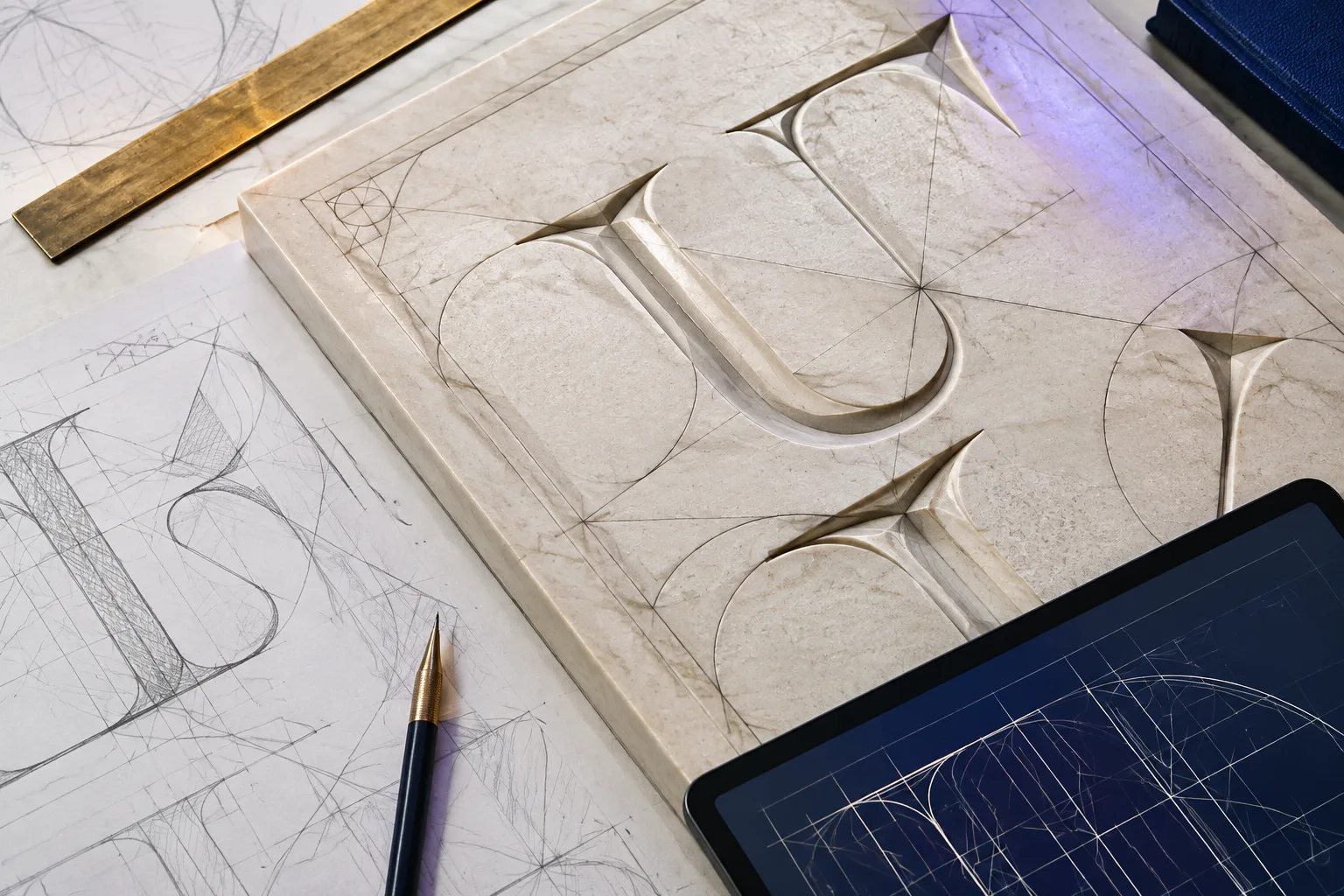
Digital lighting can change the apparent scale, material and emotional temperature of a scene without changing its geometry. A pale panel under diffuse daylight reads as an object study; the same panel against a violet storm with a narrow gold rim becomes a dramatic threshold.
Direction explains form
Light crossing a carved surface at a shallow angle produces alternating highlights and shadows that make depth legible. Front light reduces those shadows and can flatten the same relief. Neither view changes the model, but each prioritises different information.
For a teaching image, direction should help reveal the feature under discussion. If dramatic light exaggerates a groove or hides a join, the caption can say that the scene is interpretive rather than documentary.
Contrast builds hierarchy
The brightest and darkest areas usually attract attention first. A luminous central field surrounded by darker architecture creates a strong focal point; quieter borders allow the title or object to remain dominant. Local contrast can clarify an edge without making the whole frame visually loud.
Our cover keeps the panel bright and the columns darker at the sides. Lightning remains a small background accent, not a subject or symbol with historical status. The hierarchy comes from tonal design, not from a claim about ancient illumination.
Colour can join or separate
A cool violet reflection can connect stone, paper and metal across a composition, while a warm gold highlight isolates a frame or tool. Physically based rendering may simulate reflection, but colour grading can add relationships after rendering. The final image alone may not reveal which process produced the effect.
This is why production documentation matters. A digital artist can record the base materials, light sources and later colour treatment. A museum record serves a different purpose and should not be replaced by an attractive render.
Atmosphere changes scale
Cloud, haze and falloff reduce contrast with distance. The effect can make architecture appear larger because forms disappear gradually rather than ending at a visible wall. Low viewpoints and repeated columns strengthen that impression.
These are compositional strategies, not measurements. If stairs, columns and lettering imply incompatible scales, the contradiction may be intentional fantasy. Label the scene as concept art and avoid presenting its dimensions as evidence for a buildable or historical environment.
Reading takeaway
Treat digital light as authored interpretation: describe what it reveals, what it hides and how it changes hierarchy.
Sources and scope
These references support the factual frame of this article. They do not endorse its contemporary illustrations or editorial interpretation.
- The Metropolitan Museum of ArtLight on Stone: Greek and Roman Sculpture in The Metropolitan Museum of Art
Museum photographic essay used to discuss how controlled lighting reveals carved volume without changing the object’s material record.
- British MuseumGreek Revival architecture: simplicity and splendour
Evidence for later reuse of Greek architectural language in a nineteenth-century museum building.
- The Metropolitan Museum of ArtNew Research on the Color of Greek Sculpture
Scientific examination of pigment traces and the evidence-led reconstruction of ancient color.